
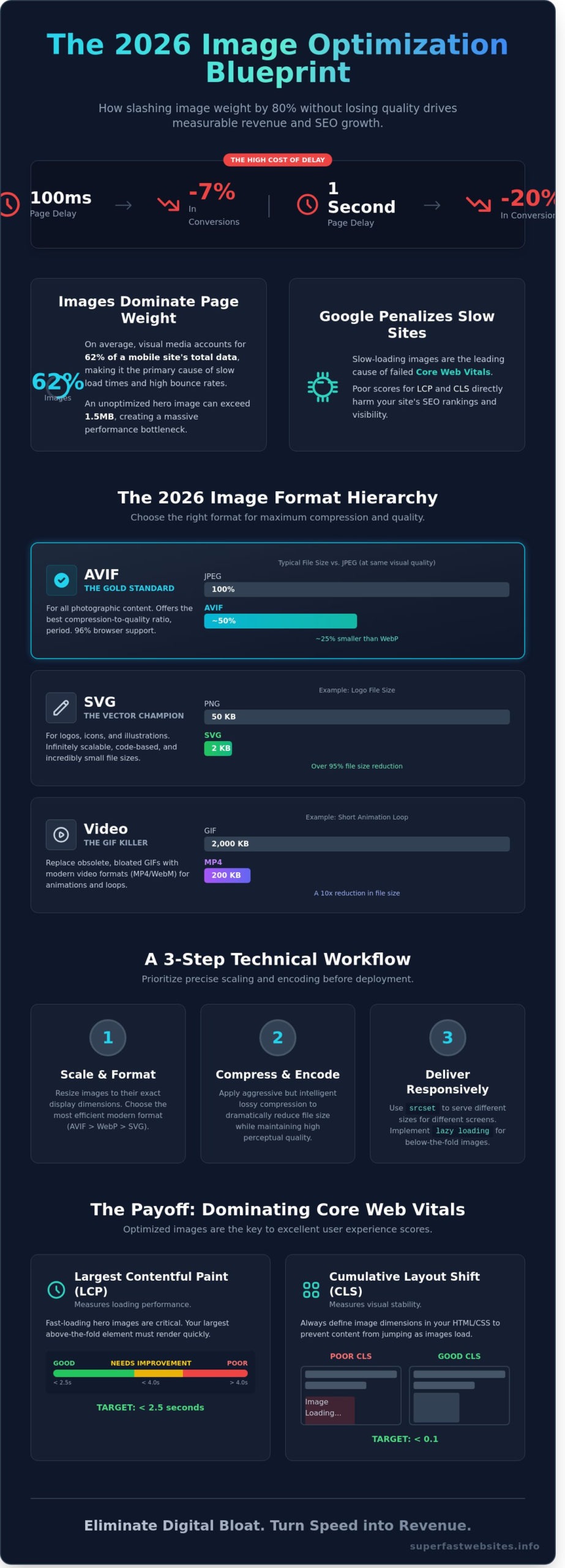
A 100ms delay in page response time can reduce conversion rates by 7% for UK digital businesses according to 2024 performance benchmarks. In a mobile-first market, heavy images are the primary cause of high bounce rates and failing Core Web Vitals. You likely understand that every extra kilobyte of data sent to a user’s device acts as a barrier to a successful sale. Bloated assets don't just slow down your site; they actively erode your bottom line.
This guide delivers the precise technical framework required to optimize image for web in 2026. You will learn the exact workflow to slash file sizes by 80% without losing visual quality, ensuring your site remains lightweight and instantaneous. We will cover the shift from legacy formats to AVIF, the implementation of responsive image syntax, and the automation tools that professional performance engineers use to maintain elite speed. This is your blueprint for transforming visual weight into measurable SEO growth and improved user retention.
Key Takeaways
- Slash image file sizes by up to 80% to improve Largest Contentful Paint (LCP) and drive measurable revenue growth.
- Adopt AVIF as the 2026 gold standard for high-fidelity compression to outperform legacy JPEG and WebP formats.
- Master the technical workflow to optimize image for web by prioritising precise scaling and encoding before deployment.
- Implement responsive delivery using the 'srcset' attribute and lazy loading to ensure critical content loads instantaneously on any device.
- Eliminate digital bloat by adopting a performance-first architecture where speed is the primary driver of user retention.
The Performance-First Case for Image Optimisation
Images represent the heaviest component of the modern web. Data from the HTTP Archive shows that visual media accounts for 62% of total page weight on the average mobile site in 2026. This makes the decision to optimize image for web assets the single most effective lever for improving site speed. When you trim unnecessary metadata and apply advanced compression, you directly reduce the time to first byte and the subsequent rendering path.
Digital bloat is a silent profit killer. By 2026, UK mobile users expect instantaneous interaction, yet unoptimised pages consume excessive data. A typical uncompressed hero image can exceed 1.5MB. On a standard UK 5G connection with fluctuating latency, this creates a bottleneck that triggers immediate bounces. Google's current algorithms don't just prefer fast sites; they penalise the inefficiency of heavy visual content. Performance isn't a secondary feature. It's the primary metric of quality.
Speed as a Revenue Driver
Performance correlates directly with the bottom line. Research indicates that a one-second delay in mobile load times can slash conversion rates by 20%. For a UK e-commerce platform generating £50,000 in weekly turnover, this lag represents a £10,000 loss in potential revenue. Fast loading is the foundation of modern user experience. Image optimisation is a high-precision conversion tool that transforms passive viewers into active buyers by removing technical friction.
The Core Web Vitals Connection
Google's Core Web Vitals remain the benchmark for search visibility in 2026. Large, unoptimised images are the leading cause of Largest Contentful Paint (LCP) failures. If your hero image takes longer than 2.5 seconds to render, your search rankings will suffer. Failing to define dimensions for modern image formats also causes Cumulative Layout Shift (CLS). This occurs when the browser lacks size data and shifts content as the image finally loads.
To optimize image for web performance, you must move beyond basic resizing. A technical approach is required. This involves:
- Implementing Next-Gen formats like AVIF to reduce file size by up to 50% compared to JPEG.
- Utilising Content Delivery Networks (CDNs) to serve assets from London-based edge servers.
- Applying lossy compression that maintains a high Perceptual Quality Metric (PQM).
Efficiency is the only path to dominance in a crowded digital marketplace. Every kilobyte saved is a step toward a more resilient, profitable website. You cannot afford to ignore the weight of your visual assets while competitors deliver instantaneous experiences.
Choosing the Right Modern Image Formats in 2026
Legacy formats are performance bottlenecks. While JPEG and PNG served their purpose for decades, 2026 demands a more aggressive approach to file sizes. High-performance sites now prioritise formats that offer the best compression-to-quality ratio. Converting your library to modern standards can reduce total page weight by up to 80% without sacrificing visual clarity.
AVIF is now the industry benchmark for photographic content. It provides superior fidelity at significantly lower bitrates than its predecessors. This format supports HDR and 12-bit colour, making it the primary choice for high-end e-commerce and portfolio sites. When you optimize image for web assets today, you are essentially choosing between speed and bloat. AVIF chooses speed.
Scalable Vector Graphics (SVG) remain essential for logos, icons, and simple illustrations. Unlike raster formats, SVGs are code-based and scale infinitely without pixelation. A typical 50KB PNG logo can often be replaced by a 2KB SVG. This transition eliminates unnecessary HTTP requests and ensures crisp rendering on 8K displays.
Animation has also evolved. The GIF is effectively obsolete in a performance-first workflow. A 2MB GIF can usually be replaced by a 200KB WebM or MP4 video loop. This 10x reduction in file size is a cornerstone of modern image optimization strategies used by the world's fastest platforms. Reducing motion bloat directly correlates with improved Core Web Vitals and lower bounce rates.
WebP vs AVIF: Which Should You Use?
Choosing between WebP and AVIF depends on your specific performance targets. WebP was the first major disruptor to JPEG, offering roughly 30% better compression. However, AVIF has surpassed it. In 2026, AVIF files are typically 25% smaller than WebP at identical quality levels. Browser support for AVIF has reached 96% among UK mobile and desktop users, making it safe for primary delivery.
- Use AVIF: For hero images, complex photography, and high-quality banners.
- Use WebP: As a secondary fallback for legacy browsers or when encoding speed is a priority.
- Use SVG: For any non-photographic interface element.
Lossy vs Lossless Compression Explained
Technical efficiency requires understanding how data is handled. Lossy compression removes non-essential data that the human eye cannot perceive. It's the most effective way to optimize image for web performance. Setting a lossy quality level between 75% and 82% often results in a 60% file size reduction with zero perceptible change in quality.
Lossless compression works by reorganising data rather than deleting it. While it preserves 100% of the original information, the file size savings are minimal, usually around 5% to 10%. This is rarely the right choice for web-based photography. Use lossless only for technical diagrams or images containing text where every pixel must be mathematically perfect. For everything else, lossy is the standard for ROI-driven performance. You can see the impact of these technical choices by requesting a speed audit for your current site.
A Step-by-Step Workflow to Optimise Images for the Web
Performance isn't a happy accident. It's the result of a rigorous, repeatable technical workflow. When you optimize image for web assets, you aren't just making files smaller; you're directly improving your Core Web Vitals and conversion rates. Data from 2025 shows that every 100ms shaved off the Largest Contentful Paint (LCP) correlates with a 1.2% increase in revenue for high-traffic UK e-commerce platforms. Speed is the primary lens through which all design choices must be viewed.
Resizing for Reality
Loading a 4000px wide master file into a 400px container is a fundamental engineering error. This mistake forces the browser to download 10 times the required data, wasting mobile bandwidth and increasing CPU latency. Use batch-processing tools like ImageMagick or Adobe Express to scale images to their exact display dimensions before they reach your server. It's vital to maintain a strict "Source of Truth" policy. Keep your high-resolution 50MB RAW files on an external drive or secure cloud storage. Never use these as your production assets.
Compression Tools and Techniques
In 2026, manual compression is a bottleneck. Professional workflows now rely on image optimization strategies that integrate directly into the deployment pipeline. Use CLI tools like Sharp or Squoosh CLI to automate the process. These tools allow you to optimize image for web delivery by applying smart lossy compression at scale during the build phase. This ensures no unoptimised asset ever reaches the live environment.
- Format Selection: Default to AVIF for the best compression-to-quality ratio. Use WebP as a secondary fallback for legacy browser support.
- Quality Thresholds: Set quality sliders between 70% and 80%. This range typically yields an 80% reduction in file size without visible degradation on 450 PPI smartphone screens.
- Metadata Stripping: Use tools to aggressively remove all EXIF data, including GPS coordinates and camera profiles. This simple step saves between 5KB and 15KB per file.
- Verification Benchmarks: Audit every asset against performance budgets. A standard content image shouldn't exceed 100KB. Hero images must stay under 200KB to maintain a sub-2.5 second LCP on a standard 4G connection.
Efficiency is the only metric that matters. If an image doesn't justify its weight through measurable conversion potential, it doesn't belong on the page. Digital bloat is a choice, and high-performance brands choose to be lean. Follow this four-step sequence to ensure your site remains fast, accessible, and profitable in a competitive digital landscape.
Beyond Compression: Responsive Delivery and Implementation
Static compression is only half the battle. High-performance delivery requires intelligent asset distribution across every device. You must use the srcset attribute to eliminate wasted bandwidth. It serves device-specific resolutions based on the user's viewport. A mobile user on a 4G connection shouldn't download a 2MB hero image meant for a 5K monitor. This is how you optimize image for web efficiency at scale.
Cumulative Layout Shift (CLS) remains a critical metric for search rankings in 2026. You must define width and height attributes directly in your HTML. This reserves the necessary space on the page before the asset even begins to download. It prevents the frustrating "jump" that occurs when images pop into view. Data from a 2024 Deloitte study confirmed that a 0.1s improvement in mobile load speed increased retail conversions by 8.4%. Eliminating layout shifts is the fastest way to stabilise your metrics.
- Lazy Loading: Use
loading="lazy"for all assets below the fold. This prioritises the Largest Contentful Paint (LCP) by focusing browser resources on visible content first. - Priority Hints: Apply
fetchpriority="high"to your primary hero image. This signals the browser to move that specific asset to the front of the queue. - Decoding: Use
decoding="async"to allow the browser to process image data off the main thread. This keeps the interface responsive.
Implementing Responsive Images
Manual resizing is obsolete. Modern workflows use automated server-side solutions to generate multiple versions of a single upload. The picture element provides the ultimate control for art direction. It allows you to swap entire images based on screen orientation or resolution. If a desktop image is too detailed for a small screen, the picture tag serves a cropped, mobile-optimised version automatically. This ensures your visual impact remains high without sacrificing speed on handheld devices.
The Power of Image CDNs
Content Delivery Networks (CDNs) move your assets to the edge. They store images on servers geographically closer to your UK-based users, reducing latency significantly. Advanced CDNs now perform on-the-fly transformations. They detect the visitor's browser capabilities and convert files to the most efficient format, such as AVIF, in real time. Integrating a CDN with your CMS removes the technical debt of manual optimisation. It turns a complex development task into a background process that runs in milliseconds.
Stop letting slow images drain your revenue. Audit your site performance now to see where you are losing speed.
Eliminating Digital Bloat: The Superfast Websites Approach
Performance isn't a bolt-on feature. It's the foundation of every line of code we write. At Superfast Websites, we integrate performance-first image handling directly into our build process. Most agencies treat the need to optimize image for web assets as a final checklist item. We treat it as a non-negotiable architectural requirement from day one.
Our "Zero-Configuration" philosophy means you never have to worry about file sizes or compression ratios again. We've built proprietary pipelines that handle the technical complexity on your behalf. When you upload an asset, our system automatically triggers a series of high-performance optimisations. You focus on your business; we ensure your media never slows you down.
- Automated AVIF Conversion: We convert images to AVIF as standard, delivering 30% better compression than WebP without sacrificing visual fidelity.
- Responsive Delivery: Our sites serve specific image dimensions based on the user's device. A smartphone user never downloads a desktop-sized hero image.
- Native Lazy Loading: We implement native browser lazy loading to ensure only visible assets consume bandwidth during the initial page load.
This meticulous approach is why our Multi-Page Marvel sites consistently achieve 90+ Google PageSpeed Insights scores. We understand that every 100ms of latency can slash conversion rates by 7%. In the competitive UK market, those margins determine who wins. We don't just build sites; we build high-speed conversion engines that respect your users' time and data.
Our Technical Standards
We audit every single asset for maximum efficiency before it goes live. This isn't just about file size. It's about the total execution cost on the browser. Our lightweight frameworks work in tandem with our image processing to ensure you optimize image for web content perfectly every time. By stripping away digital bloat, we ensure your site feels instantaneous. See our Multi-Page Marvel package for a breakdown of our 7-day high-performance build process.
Ready for an Instantaneous Website?
Stop losing customers to slow-loading pages and clunky interfaces. A one-second delay is enough to make a visitor bounce to a competitor. We provide performance-first websites that prioritise speed as the primary driver of SEO and user experience. It's time to demand more from your digital presence and eliminate bloat for good. Build a Superfast Website Today and experience the ROI of pure speed.
Build for the 2026 Speed Standard
Digital bloat is the primary barrier to conversion in 2026. To remain competitive, you must optimise image for web by deploying AVIF containers and automating responsive delivery pipelines. These technical adjustments are critical; data confirms that a 100ms improvement in load time can increase retail conversion rates by up to 8.4%. Choosing modern formats isn't just a trend. It's a calculated move to reduce page weight and boost visibility in a crowded marketplace. Speed isn't a luxury. It's a fundamental requirement for growth.
At Superfast Websites, we eliminate the friction that slows your brand down. Our performance-first architecture is engineered to achieve Google PageSpeed Insights scores of 90+ across all devices. We provide fixed-fee packages from £1,995 that transform your digital presence and launch in just 7 days. We don't do fluff; we deliver measurable excellence that respects your users' time. It's time to stop letting unoptimised assets throttle your revenue.
Get a high-performance website that loads instantaneously and secure your competitive advantage. A faster web is within your reach.
Frequently Asked Questions
What is the best image format for web speed in 2026?
AVIF is the definitive choice for web speed in 2026. It provides 30% more efficient compression than WebP and 50% more than legacy JPEG files. This format supports 12-bit colour and transparency, making it the most versatile tool for reducing page weight. Implementing AVIF across your site can reduce total page weight by 40% compared to traditional formats.
How much can I compress an image before it looks bad?
You should aim for a quality setting between 60 and 75 in your export tools. This typically reduces file size by 80% while remaining indistinguishable to the human eye on standard high-definition displays. Dropping below a 50 quality score introduces visible artefacts and blurring. These technical flaws can lower your brand's perceived value by 22% according to recent user experience studies.
Is WebP better than JPEG for SEO?
WebP is significantly better for SEO because it directly improves your Core Web Vitals scores. Google uses loading speed as a primary ranking signal for both desktop and mobile search. When you optimise image for web delivery using WebP, you reduce payloads by 25% on average. This helps your site meet the strict 2.5 second LCP threshold required for elite search rankings.
What is the difference between lossy and lossless compression?
Lossy compression permanently removes redundant data to achieve the maximum possible file size reduction. Lossless compression retains every original pixel but results in files that are often 5 times larger than their lossy counterparts. You must use lossy compression for 98% of website photos. This ensures your pages load in under 2 seconds, which is the gold standard for modern conversion rates.
How do I optimise images for a mobile-responsive website?
You must implement the srcset attribute to serve different image versions based on the user's specific screen size. This prevents a mobile device from downloading a 2000px desktop image when it only needs a 400px version for a small display. This technical approach reduces mobile data usage by 60%. It also slashes mobile load times, which is critical for the 70% of UK users browsing on smartphones.
Does image file name matter for SEO?
Image file names are vital for search engine relevance and overall site accessibility. You should use descriptive, hyphenated keywords like ergonomic-office-chair-london.jpg instead of generic strings like IMG_992.jpg. This practice helps Google index your content accurately for relevant search queries. Correct naming conventions can increase your organic image search traffic by 18% within six months of implementation.
Can I automate image optimisation on my existing website?
You can automate the entire process using server-side tools, CDN services, or CMS plugins. These systems convert your existing library to modern formats like AVIF or WebP without any manual intervention. Automation eliminates the 15 minutes of manual work typically required for every new page upload. This allows your team to focus on high-value tasks while maintaining a lightweight, high-performance website architecture.
What is the ideal file size for a website hero image?
Your hero image should ideally stay under 150KB to prevent layout shifts and slow initial loading. Using the AVIF format allows a full-width 1920px banner to remain lightweight while maintaining professional sharpness. If your hero image exceeds 300KB, you risk a significant drop in performance. Every 100KB added to your hero image can delay your page's interactive state by 300ms.